
Designing an HTML invoice that prints correctly
Repeating table headers, keeping the total block together, and margins that survive both A4 and Letter.
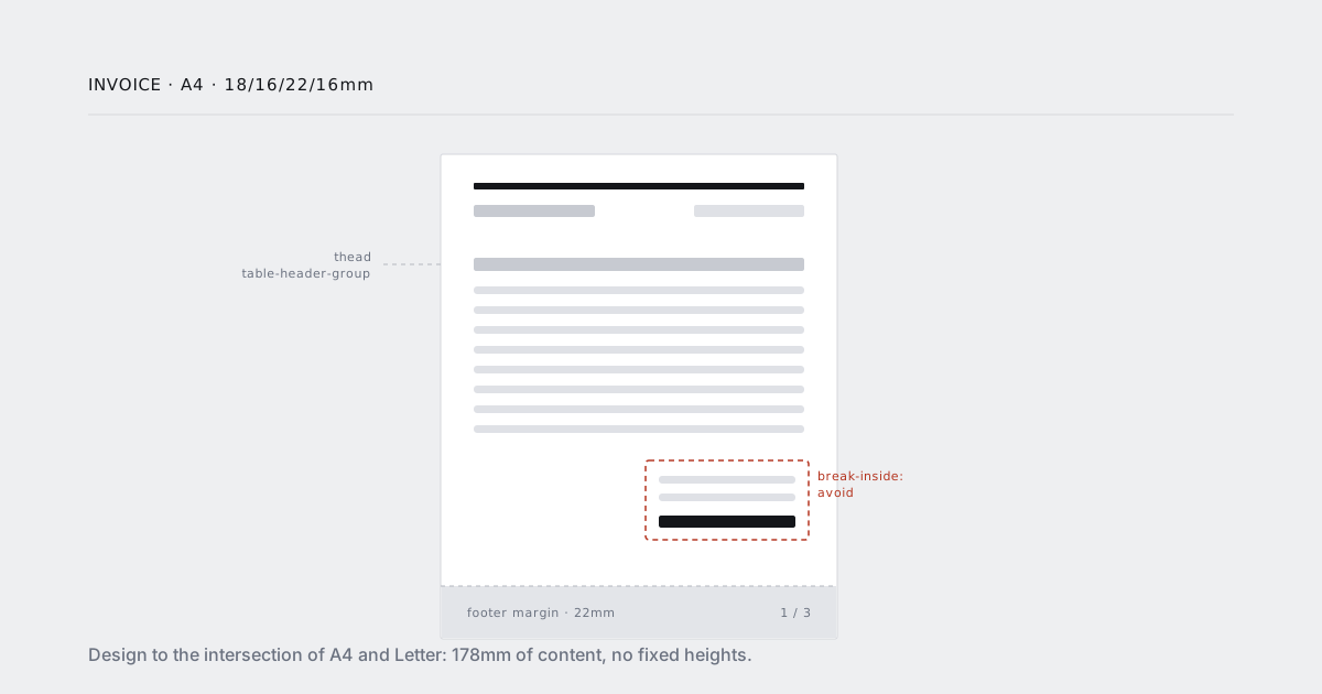
An invoice is the easiest document to render and the least forgiving one to get wrong. It is short, it is mostly a table, and every mistake is arithmetic in front of a customer: a total that lands alone on page three, a header that vanishes, a column that runs off the right edge on Letter and not on A4.
This is the CSS that survives all of that. It is not long. Most of the work is deciding to stop laying out a screen and start laying out a page.
Start from the page box, not the body
The single most common mistake is faking margins with body padding. Padding scrolls with content; page margins do not. Set the page box:
@page {
  size: A4;
  margin: 18mm 16mm 22mm 16mm;
}

body {
  margin: 0;
  padding: 0;
  font: 10pt/1.45 "Inter", system-ui, sans-serif;
  color: #14161a;
}
Use pt and mm here, not px. Print units are absolute and mean the same thing regardless of the device pixel ratio the renderer happens to use. Your screen stylesheet can carry on using rem.
Note the asymmetric bottom margin. That 22mm is not aesthetic. It is the space reserved for the footer, and it comes up again below.
A4 and Letter, without two stylesheets
A4 is 210 × 297mm. US Letter is 216 × 279mm — wider and shorter. If you design to the edges of one, you clip on the other.
Design to the intersection instead:
- Width: the narrower page is A4 at 210mm. With 16mm side margins that leaves 178mm of content. Cap your container at
max-width: 178mmand nothing overflows on either. - Height: the shorter page is Letter. Never rely on a fixed content height, and never build a footer by absolutely positioning something at a hardcoded
top. Let content flow and let the engine break it.
Then let the format be a render-time parameter rather than a stylesheet fork:
const pdf = await client.render({
  url: signedInvoiceUrl(invoice.id),
  format: customer.country === "US" ? "Letter" : "A4",
  margin: { top: "18mm", right: "16mm", bottom: "22mm", left: "16mm" }
});
One template, one stylesheet, two page sizes.
Repeating the table header
A line-item table that spans pages needs its header on every page. This is free if the markup is honest:
<table class="items">
  <thead>
    <tr><th>Description</th><th>Qty</th><th>Unit</th><th>Amount</th></tr>
  </thead>
  <tbody>
    <tr><td>…</td><td>…</td><td>…</td><td>…</td></tr>
  </tbody>
</table>
thead { display: table-header-group; }
tfoot { display: table-footer-group; }
tr    { break-inside: avoid; }
Two things break it, both inherited from the screen stylesheet:
position: stickyon the header row. It does nothing in print and it takes the header out of the repeat path. Scope it to@media screen.- Divs pretending to be a table. A flexbox grid of rows has no header group to repeat. If it is tabular data, use a table. Print is the one context where the semantic markup is also the pragmatic choice.
Keep break-inside: avoid on rows, not on tbody. On rows it stops a single line item from splitting mid-cell. On tbody it asks the engine to keep the entire body together, which for a sixty-line invoice is impossible — and an impossible avoid is silently dropped.
Keeping the total block together
The total block splitting across a page boundary is the failure customers actually notice. Wrap it once, and only once:
.summary {
  break-inside: avoid;
  margin-top: 8mm;
}

/* do NOT also put break-inside: avoid on .totals or .payment-terms */
The rule that matters: break-inside: avoid is a request, and it is dropped whenever the box cannot fit on a page of its own. So keep the wrapper comfortably short. If your summary includes payment terms, bank details and a legal mention, it can approach a full page on Letter — at which point the avoid does nothing and you are back to a split total, with no warning.
If it is getting tall, split it deliberately: keep the numbers in the avoid wrapper, let the boilerplate flow after it.
To stop the summary from landing alone on a final page, pull it up with the table:
.items { break-after: avoid; }
That asks the engine not to break between the table and what follows. Like avoid, it is best-effort — but combined with a summary that fits, it holds.
Text blocks get the usual treatment:
p  { orphans: 3; widows: 3; }
h2 { break-after: avoid; }
Page numbers go in the margin, not the document
Chromium does not support content: counter(page) in @page margin boxes. Every "add page numbers with pure CSS" answer you find either targets Paged.js or does not work.
Page numbers come from the render call:
const pdf = await client.render({
  url: signedInvoiceUrl(invoice.id),
  format: "A4",
  margin: { top: "18mm", bottom: "22mm" },
  header_html: `<div style="font:8pt sans-serif;width:100%;padding:0 16mm;color:#6b7280">
                  Acme, Inc. · Invoice ${invoice.number}
                </div>`,
  footer_html: `<div style="font:8pt sans-serif;width:100%;padding:0 16mm;color:#6b7280">
                  {page} / {total}
                </div>`
});
Three things about header and footer templates that cost people an afternoon each:
- They do not inherit your CSS. Not your fonts, not your colours, not your variables. Style them inline, in the template itself.
- They have no page margin of their own. They span the full paper width, so add the horizontal padding yourself or they will sit flush against the paper edge.
- They do not push your content. Their height is not accounted for anywhere. This is the next section.
Reserve space for the footer, with slack
Because the footer paints into the margin and does not affect layout, the page margin has to be at least as tall as the footer. If it is not, the footer prints on top of your last table row.
Rules of thumb that have held up:
| Footer content | Bottom margin |
|---|---|
| One line of 8pt text | 15mm |
| Two lines | 22mm |
| Anything with a logo | measure it, add 6mm |
Same for the header and the top margin. And leave slack — line-height inside those little templates is not something you control precisely, and a document with zero millimetres to spare is a document that overlaps the first time anything moves.
Backgrounds, borders and zebra rows
Renderers drop background colours by default, the same way your printer does. Zebra striping, the brand band across the top, the shaded total row — all gone unless you ask:
.summary,
.items tbody tr:nth-child(even),
.brand-band {
  print-color-adjust: exact;
  -webkit-print-color-adjust: exact;
}
Prefer borders and weight for structure anyway. A table that reads correctly in pure black and white is a table that survives being printed on someone's office laser, which is still where a lot of invoices end up.
Fonts
Self-host, subset, and declare a fallback that covers your customer names:
@font-face {
  font-family: "Inter";
  src: url("/fonts/inter-subset.woff2") format("woff2");
  font-display: block;
  unicode-range: U+0000-00FF, U+0100-017F;
}

body {
  font-family: "Inter", "Noto Sans JP", "Noto Sans", sans-serif;
}
font-display: block is correct here, not on screen: you would rather the render wait than capture invisible text. And the CJK fallback is not optional the moment you have one Japanese customer — a Latin-only subset renders their company name as a row of empty boxes, and they will be the ones to tell you.
Long descriptions and the right-hand column
Line-item descriptions are user input. Someone will paste a URL with no spaces in it.
.items td:first-child {
  overflow-wrap: anywhere;
  hyphens: auto;
}

.items td:not(:first-child) {
  white-space: nowrap;
  text-align: right;
  font-variant-numeric: tabular-nums;
}
tabular-nums is the small detail that makes a column of amounts look right: digits get equal width, so the decimal points line up without any extra markup.
Test with sixty line items
The bug is never in the one-item invoice you designed against. Keep three fixtures and render all three in CI:
- 1 item — the layout you actually designed
- 12 items — fills roughly one page, catches the summary landing alone
- 60 items — the only one where fragmentation actually happens
Assert on page count. It is a single integer, it is stable when nothing is wrong, and it moves the instant something is. When it moves unexpectedly, that is usually the engine and not you.
The whole stylesheet
@page { size: A4; margin: 18mm 16mm 22mm 16mm; }

body        { margin: 0; font: 10pt/1.45 "Inter", "Noto Sans JP", sans-serif; color: #14161a; }
.sheet      { max-width: 178mm; margin: 0 auto; }

thead       { display: table-header-group; }
tfoot       { display: table-footer-group; }
tr          { break-inside: avoid; }
.items      { width: 100%; border-collapse: collapse; break-after: avoid; }
.items td:first-child       { overflow-wrap: anywhere; hyphens: auto; }
.items td:not(:first-child) { white-space: nowrap; text-align: right;
                              font-variant-numeric: tabular-nums; }

.summary    { break-inside: avoid; margin-top: 8mm; print-color-adjust: exact;
              -webkit-print-color-adjust: exact; }

p           { orphans: 3; widows: 3; }
h2          { break-after: avoid; }

@media screen { thead th { position: sticky; top: 0; } }
That is most of it. The rest is the render call, and the invoices guide covers the parameters — signed URLs, wait_for on the total, retention long enough to satisfy your accountant.